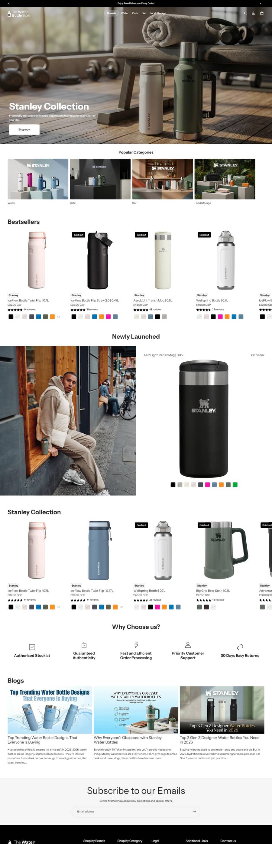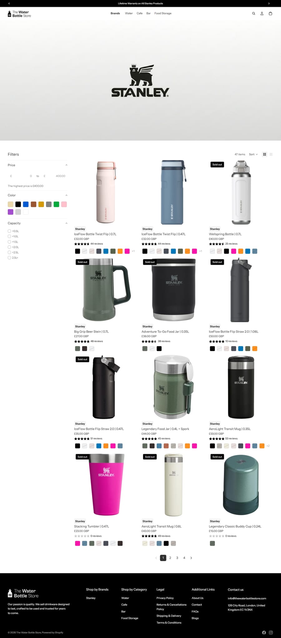
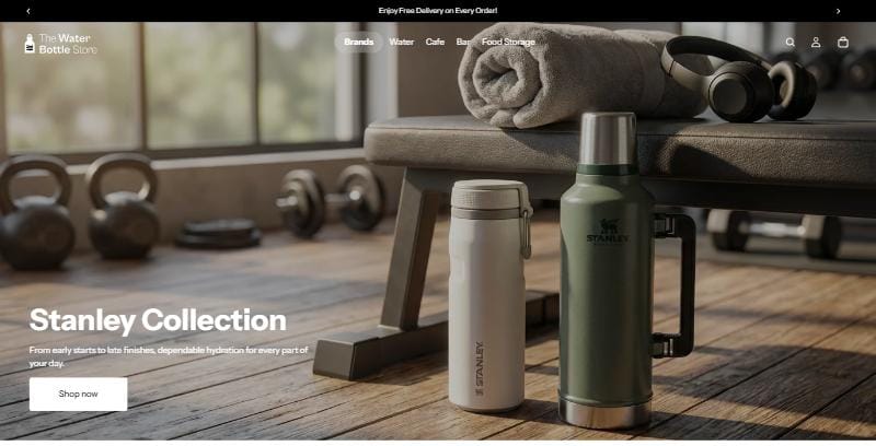
The Water Bottle Store UK is a British retailer of reusable bottles, flasks and food containers, stocking its own range alongside brands including Stanley. Demand for sustainable drinkware was growing; the store itself was the constraint.
The challenge
The catalogue had outgrown the storefront. Four issues compounded each other:
- Outdated UX — a cluttered interface that made a broad, multi-brand catalogue harder to navigate than it needed to be
- Lost sales — high cart abandonment and weak mobile responsiveness, in a category where most browsing happens on a phone
- No engagement — no post-purchase communication, so repeat purchase relied on the customer remembering to come back
- Missing automation — nothing guiding or supporting the customer journey at any scale
Individually each was survivable. Together they capped growth: traffic arrived, struggled to find the right product, and left without a reason to return.
Our approach
Rebuilt the product experience
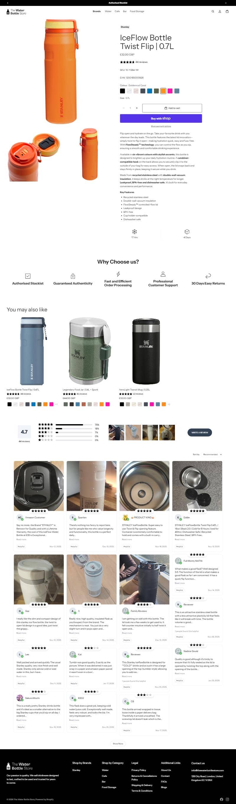
Product pages were reworked around clearer visuals, fuller descriptions and visible trust elements — reviews surfaced through Judge.me rather than buried below the fold. For considered purchases in a crowded category, social proof placed near the buying decision does more than placement further down the page.
Restructured navigation for a multi-brand catalogue
The store sells across distinct use cases — water, café, bar, food storage — as well as by brand. Collections were rebuilt around how customers actually shop, with Shopify Search & Discovery layered over the top so filtering happens inside a collection rather than sending people back to the start.
Addressed page speed directly
Performance work was measured against Lighthouse rather than judged by feel. On mobile, where sessions are short and competing options are one tap away, load time is a commercial problem rather than a technical nicety.
Shortened the path to payment
The store runs Shopify’s accelerated checkout with Shop Pay, PayPal and Apple Pay surfaced on the product and cart pages, so a returning shopper pays without re-entering card or address details. Reducing abandonment is rarely one fix — it is removing the recovery gap and the friction that caused the abandonment in the first place.
Closed the lifecycle gaps
Two automations did most of the work: abandoned-cart recovery, addressing the largest single source of lost revenue, and post-purchase follow-up, giving the brand a reason to contact customers after fulfilment. Customer tagging and segmentation inside Shopify made both targetable rather than generic. Fulfilment tracking and order status updates were streamlined at the same time.
Why it worked
Nothing here was exotic. There was no replatform, no headless rebuild, and no bespoke infrastructure — the store stayed on Shopify and on a Shopify theme.
The gains came from fixing the parts customers actually touch: finding the product, trusting it enough to buy, and hearing from the brand afterwards. That is usually where the recoverable revenue sits, and it is a cheaper place to find it than a replatform. Part of our job is saying when that is the case — see platform migration for the times it genuinely is not.