If your Shopify store has dozens or hundreds of SKUs, poor navigation is conversion poison.
The faster users find what they want, the more likely they are to purchase.
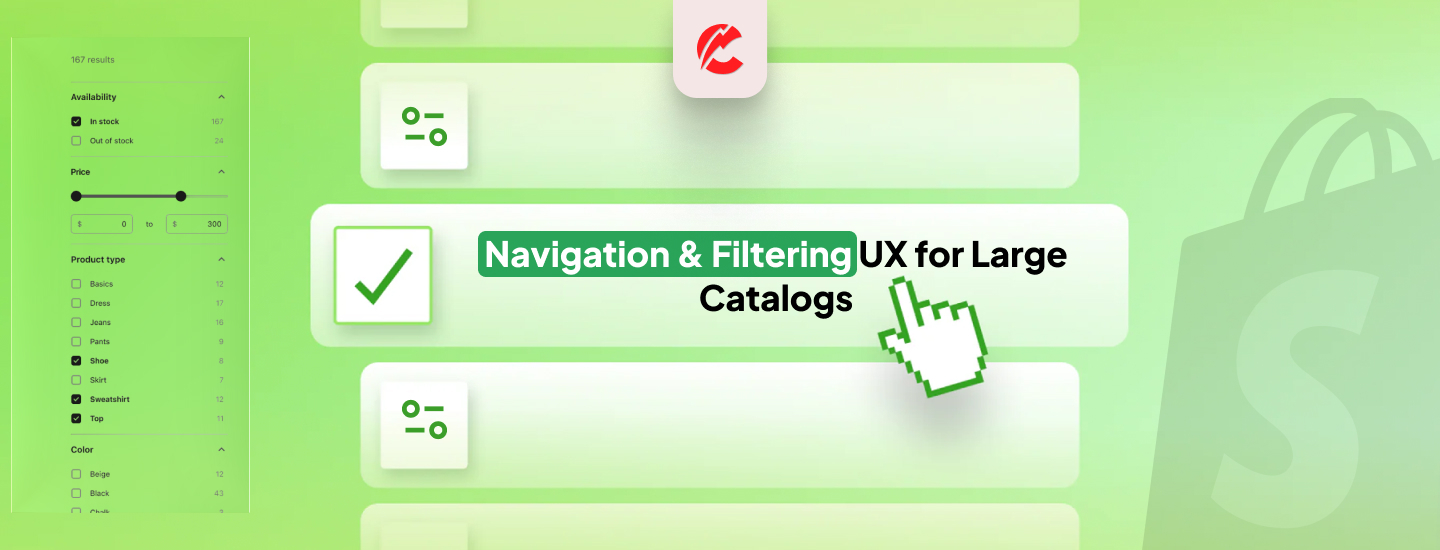
Here’s how to design navigation and filtering that scales:
1. Simplify Top-Level Navigation
- Use 4–6 main categories max
- Group related products (e.g., “Women,” “Men,” “Accessories,” “Sale”)
- Keep labels short and clear
2. Mega Menus for Visual Browsing
- Use Shopify themes like Impulse, Prestige, or Motion for built-in mega menus
- Include subcategory columns, image tiles, and featured products
- Group by type, material, price range, or use case
3. Smart Product Filtering (Faceted Search)
- Let users filter by:
- Price
- Size
- Color
- Tags (e.g., “Eco-Friendly,” “Made in UK”)
- Use Boost Product Filter & Search or Searchanise for powerful filter systems
4. Sticky Filters & Mobile Drawer Filters
- Ensure filters remain accessible as the user scrolls
- On mobile, use slide-out filter drawers with collapsible sections
- Prioritize usability and clarity over complexity
5. Search That Learns & Suggests
- Autocomplete and typo-tolerant search
- Suggest trending or popular searches
- Use tools like Doofinder, Algolia, or Searchspring
6. Include Visual Cues in Menus
- Add icons or thumbnails to category links
- Show “New” or “Sale” badges
- Highlight active filters to avoid confusion
7. Analytics to Identify Drop-Off Points
- Use Hotjar, Lucky Orange, or Shopify’s native reports
- Identify where users abandon search or navigation flows
Final Thoughts
A well-designed navigation structure turns chaos into clarity. It empowers users to browse intuitively, spend more time on-site, and buy more.
Need help organizing your catalog or building smart filters? Talk to CommerceBolt’s UX team.