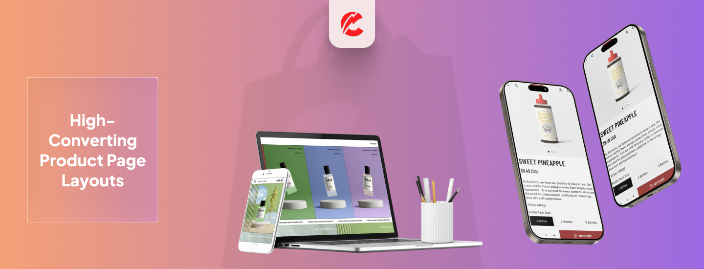
Over 70% of Shopify traffic comes from mobile — yet many stores still prioritize desktop design.
A mobile-first UX doesn’t just mean responsive layout. It means designing for small screens first, with conversion at the core.
Here’s how to do it right:
1. Prioritize Performance
- Compress images using tools like TinyIMG
- Avoid heavy animations or slow-loading carousels
- Use Shopify’s Lighthouse report to audit speed
2. Design for Thumb-Friendly Interaction
- Keep CTAs large, centered, and not too close to screen edges
- Make tappable areas at least 44px tall
- Place Add-to-Cart and Buy Now buttons above the fold
3. Sticky Elements that Support Flow
- Sticky header with logo, menu, and cart
- Sticky add-to-cart button on product pages
- Sticky filter or sort on collection pages
4. Mobile Navigation Best Practices
- Use slide-out menus (hamburger icon)
- Limit nav options to key categories only
- Use accordions or collapsible sections for submenus
5. Minimize Text, Maximize Visuals
- Use bold headlines and short subheadings
- Let images and video communicate value
- Include lifestyle imagery with zoom/tap-to-expand
6. Mobile Checkout Optimization
- Enable Shopify’s accelerated checkout (Shop Pay, Apple Pay, GPay)
- Reduce required fields
- Pre-fill address data if possible
7. Test on Real Devices, Not Just Emulators
- Audit UX on iOS, Android, and various screen sizes
- Look for thumb reach, load time, and visibility issues
Final Thoughts
Mobile-first is not mobile-only. But designing for mobile ensures your store works where customers are — in their hands.
Want a mobile audit of your Shopify store? Talk to CommerceBolt’s UX team.