Your Shopify checkout is where interest turns into revenue — or disappears. Every unnecessary field or confusing step risks abandonment.
Here’s how to tighten your checkout UX and boost conversions:
1. Enable Express Checkout Options
- Add Shop Pay, Apple Pay, Google Pay, PayPal Express
- Auto-fill shipping and billing info
- Prominent button placement above fold
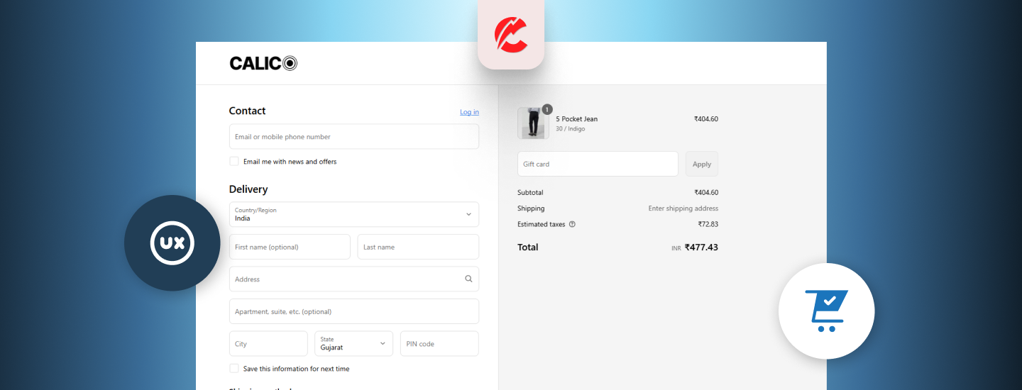
2. Reduce Form Fields
-
Shopify already optimizes for this — but consider:
-
Removing Company field (unless B2B)
-
Auto-filling country or postal code when possible
-
Pre-selecting shipping method if only one exists
-
3. Use Progress Indicators
- “Step 1 of 3: Shipping → Payment → Review”
- Reduces anxiety and increases trust
- Built into most Shopify Plus checkouts or available via custom code
4. Trust & Security Icons Near CTA
- Add “Secure Checkout” badges
- Display accepted payment method logos
- Reinforce free shipping or money-back guarantee
5. Enable Cart Drawer or Slide-In Checkout
- Apps like Slide Cart Drawer or Rebuy streamline flow
- Prevents page reloads and increases UX continuity
6. Show Total Costs Upfront
- No hidden shipping or tax surprises
- Offer “Shipping Calculator” before checkout or on cart page
- Show discount/promo code impact in real time
7. Mobile-Optimized Layout
- Large input fields and CTA buttons
- Sticky “Continue” or “Pay Now” buttons
- Avoid accordion-style forms that are slow on touch
Final Thoughts
Your checkout isn’t the end of the funnel — it’s the final conversion battlefield. Get the details right, and you’ll boost sales without spending more on traffic.
Need a Shopify checkout optimization review? CommerceBolt can help.